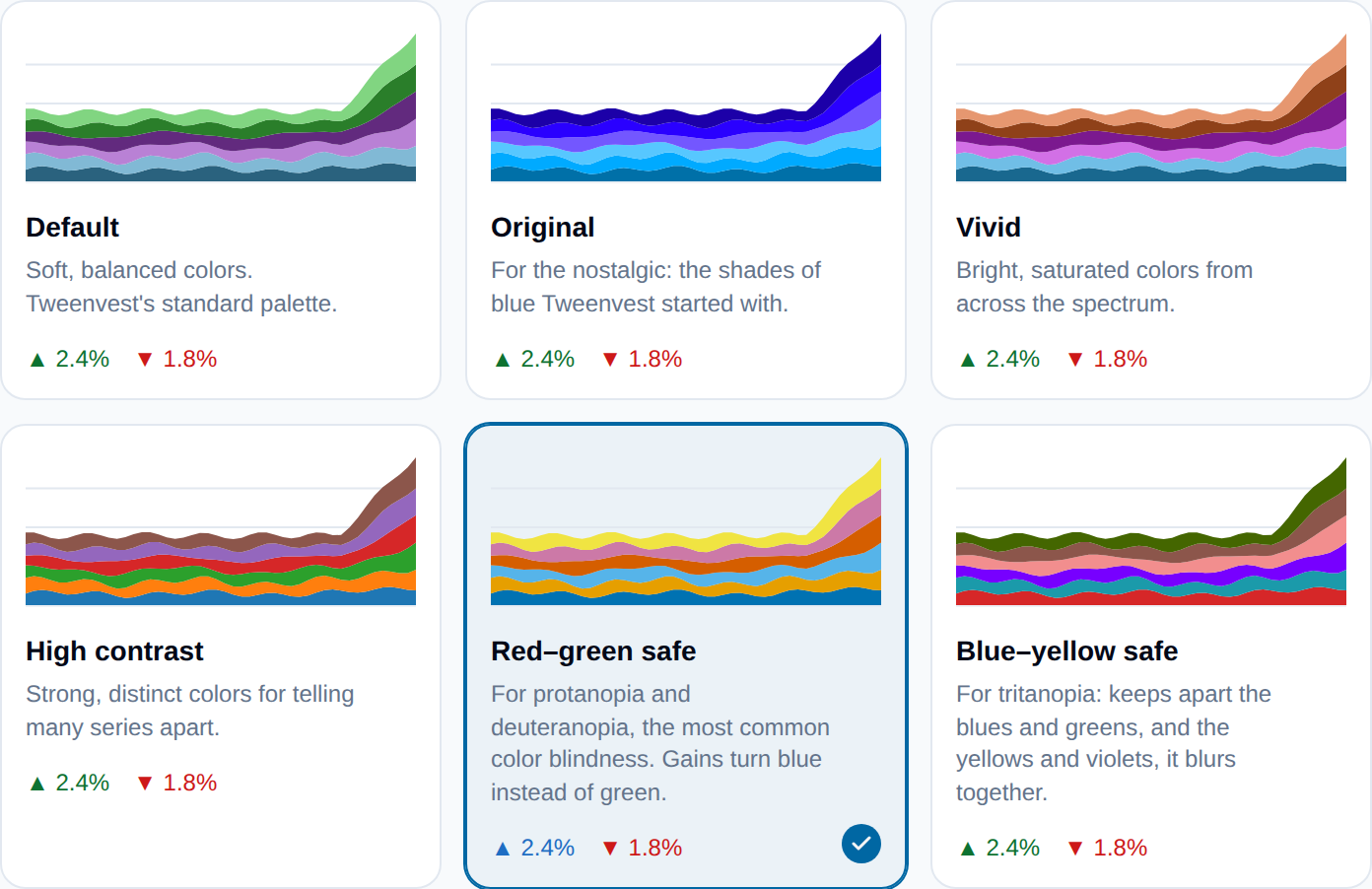
Chart colors now live in Settings → Preferences as a set of cards. Each one draws a small chart in its own colors, so you can see what you are picking before you pick it, and the change applies the moment you click.
Two of the six are new, and built for color blindness. Red–green safe is for protanopia and deuteranopia, the most common kinds. Its colors stay apart for people who see red and green alike, and it also turns gains blue instead of green across the app: prices, sparklines, the market map and charts. Blue–yellow safe is for tritanopia. We picked both by simulating each kind of color blindness and checking that every pair of colors stays distinguishable.
The palettes you already had are still there: Default, Vivid, High contrast, and Original, the blues Tweenvest started with. Your choice now reaches every chart, including a few that used to ignore it, like the portfolio breakdown and the dividend chart.